

Nowadays, the game of baseball is built around young stars. Fernando Tatis Jr, Vladimir Guerrero Jr, Wander Franco, the list goes on. People often give baseball a bad rap for being a “boring sport” to watch. The game is often played at a slow, chess-like pace. All these young superstars bring passion to the game and make it exciting to watch. Many players nowadays come from different countries around the world, bringing hype and excitement all over the earth. From the diving catches to the 40 homer seasons, and the crazy slides into bases when stealing, these young kids are making a name for themselves all over the US. A common theme with young stars is they are very flashy. Some new, young uniforms that were released this year embrace that idea better than almost anything. Some uniforms embrace the culture, some have new and bright colors, and some help connects better to their respected cities. And for the most part, they all look very clean and good. Let’s get into the top 9 best uniforms that were released in the 2020- 2021 season.
Disclaimer: One thing you will notice in this list is a lot of these uniforms have baby blue in them
9: Pittsburgh Pirates new Alternate and Away uniforms
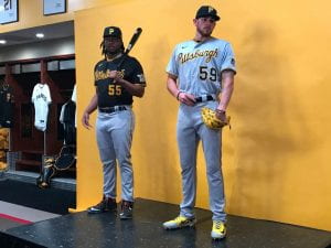
Another very sneaky clean uniform was released in 2020. The Pittsburgh Pirates are known for having some ridiculously bad uniforms (ESPN). These new black and gray uniforms that were released last year are very clean. They might not stand out necessarily as a flashy and sexy pick, but they are very lowkey and clean. A very subtle uniform that is all around smooth. The obvious inspiration for these jerseys was the retro 70s uniforms the Pirates used to rock. They cleaned up and redid these new uniforms, but they came out looking very good and underrated If only the Pirates could play as good as their uniforms were.
Overall Rating: 6.5/10
8: Diamondbacks City Connect uniforms
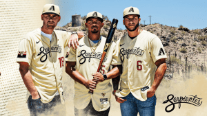
A pretty sneaky pick here. One of the back half choices of the best city connect jerseys that came out during the 2021 season. I do like the cream-colored jersey fill, with the clean-cut black cursive text with the snake twist in there. My diamond dynasty jerseys look very similar to these, but with red pinstripes as well. The only reason I didn’t rank these higher, is that they wear white pants with them. If they were to wear them with matching cream pants, man oh man would these get more hype. These look exactly like my Diamond Dynasty jerseys, only mine has red pinstripes. Overall, these uniforms are very solid.
Overall Rating: 7/10
7: Chicago Cubs City Connect uniforms
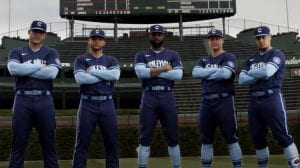
Ah yes, the Wrigleyville City Connect uniforms. I do know that these uniforms have had a lot of mixed reviews since they came out, and I am leaning towards the side of positivity. I do like these uniforms. They are a really clean mix of two of my favorite colors, baby blue, and navy blue. Many people have criticized these uniforms and say the colors should be switched, and while I can see what they are talking about, I like these uniforms the way they are. The two colors are the same color but just different shades and tones which helps the two colors balance each other, but the main reason I like these uniforms is just how simple they made them. Lots of times new jerseys have too much on them; color, designs, logos, etc. All these uniforms are a navy blue base with a baby blue and white stripe above the elbow on the sleeve, and then the baby blue sleeves and socks. A very good job at balancing out the two colors evenly so that there isn’t too much of one color, but also not too much of it. Add the hats into the mix as well, and you have a very well-balanced uniform.
Overall Rating: 7/10
6: San Diego Padres 2020 brown uniforms
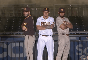
The San Diego Padres were the most exciting team to watch in 2021 in terms of young talent and superstars. They had it all, and when their season was cut short and didn’t make the playoffs, fans of this franchise were heartbroken, heck even I was heartbroken. Before the 2020 season, the Padres announced their new Home, Away, and Alternate uniforms for the 2020 season. And again, the Padres are a franchise that is notorious for wearing really ugly uniforms (Brew Crew Ball). The Padres decided now was the time to shuffle up the uniform game and change the jerseys completely. And maybe the jerseys were good luck because, for the first time in the history of the franchise, the Padres had a very good team that made the playoffs and went pretty deep until they were stopped by the Dodgers. Regardless, we’re here for the uniforms, let’s be honest, right? These new brown and white mixed uniforms are the real deal. Inspired by a monk’s color (that is why they are called the Padres after all), these uniforms are very clean and make all of their players look good. I love the mix of yellow in there as well, to make the jerseys pop and stand out a little. Every good uniform has at least a little bit of color to make it stand out and pop, and the Padres executed that well here when they made these uniforms. I do believe that these jerseys are somewhat inspired by the 70s Padres uniforms, but let’s be honest, these look way better.
Overall Rating: 8/10
5: Milwaukee Brewers Navy Blue 2020 uniforms
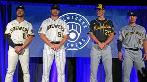
These uniforms are the real deal. All 4 of them in their respected right look so good in their way, they all combine to make a freaking good set of uniforms the Brew Crew launched back in 2020. All of the colors match together in perfect harmony almost. The white uniform has everything a basic white home uniform should have, a clean white jersey, a secondary color, that being navy blue, and that color that makes it pop, similar to the Padres that color is yellow. There is also the pinstripe, which is the same thing but more white and just pinstripes. And of course the gray, which are the white ones replaced by gray, and they look very good. The Brewers are another National League Central team that has been notorious for not having the best uniforms ever, but these navy blue uniforms completely flip the script on that narrative, just by themselves. My personal favorites are the navy blue ones, again much similar to the Padres, but I think these are a little better. The beautiful combo of yellow and navy blue with the fancy and unique text across the chest. I think if they wore them with white pants instead they would compliment each other a little better, but I understand that they were meant for on the road
Overall Rating: 8/10
4: Chicago White Sox City Connect uniforms
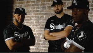
Now, I will admit, being a White Sox fan probably doesn’t help this at all, but hear me out, these uniforms are nice. The White Sox are a team whose main colors are black, white, and gray. It seems like there are limited options for jerseys with only black and white and a little silver, but the Southside proved that method wrong. These clean black with silver pinstripe uniforms look very good. The White Sox nailed it on the head with this one. The pinstripes aren’t obvious, but you can still see them which makes it very subtle and clean. If the pinstripes are too thick or noticeable it will make the uniform look bad, but these uniforms don’t have that. I also love the kind of street biker vibe the text across the text gives off. The White Sox have the reputation as being the dirty Southsiders that are nasty, Grimey, and mean, and that’s the feeling I get just reading the font, “Southside”. And that’s why these uniforms just scream Southsiders.
Overall Rating: 8/10
3: Toronto Blue Jays Baby Blue uniforms
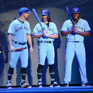
Now, THIS is what I love to see. This is basically what I’m talking about when people wanted the Wrigleyville colors swapped, and I think it looks a little better. The baby blue is exactly what baby blue should look like, mixed with the navy blue to complement it, mix in a little white and you have a really clean uniform. These are a remake from the 70s Blue Jays uniforms, and man oh man did these not only get recreated, they got upgraded as well. This is such a nice uniform the Blue Jays have recreated, and with the young squad they have, these jerseys complement them well.
Overall Rating: 8/10
2: Texas Rangers baby blue uniforms
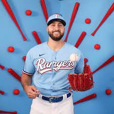
These uniforms are so sexy. The perfect shade of baby blue is complimented well by the Rangers royal blue, throw in a little bit of red, and you have a dang near perfect uniform. The Rangers are in the middle of a rebuild as of now. These are very similar to my Diamond Dynasty uniforms, which are the same shade of baby blue with red sleeves and an outline of white text across the text. Again, I do like how perfect this shade of baby blue is. This is exactly what baby blue should look like. I also love the text across the text. The classic and curvy Rangers across the text in white with the red drop shadow is spot on and compliments the baby blue on the uniform. I would have to see if the uniforms would look good with baby blue pants to match, but I like these uniforms with white pants. What a uniform though.
Overall Rating: 9/10
1: Miami Marlins City Connect Uniforms
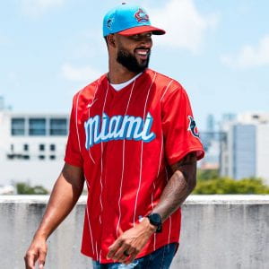
Ladies and gentlemen, your winner of my top 9 best uniforms, the Miami Marlins City Connect jerseys. These jerseys are perfect in every way possible. The combination of red and baby blue is probably the best combination of colors you can get, and the Marlins nailed the perfect balance of scarlet red with their little twist of baby blue that looks very clean. The super nice text across the chest in white with the baby blue border is very good. I like the font they chose. The white subtle pinstripes that are spread apart make this uniform look even better. I think if they did too many pinstripes it wouldn’t look good, and it would look too much like a traditional pinstripe uniform. This isn’t the look Miami is going for. With their young talent and stars, they are looking to put a unique spin on things, make things their way. The white pants fit well, and the baby blue socks change the tempo up instead of red dominating here. Plus the super clean baby blue hat with the red brim, and this is your king ladies and gentlemen. Miami’s lineup is spread throughout with Cuban, Puerto Rican, and Dominican players. Jazz Chisolm, Jesus Aguilar, Sandy Alcantara, Lewin Diaz, the list goes on. These uniforms were made to embrace the Spanish culture in the clubhouse, and they do just that. With the vibrant colors relating to the Cuban flag, this uniform is perfect.
Overall Rating: 10/10
There you have it, my top 9 favorite uniforms revealed within the last 2 years. These young kids are taking over the game, and they bring swag and passion. One way to express swag is through clean uniforms, and soon, the uniforms will take over the MLB and bring excitement back to the game we know and love.